When I began to put together ideas for my header and business card designs, I started of with design styles that I was comfortable with and I didn't try to break away from my minimalist style of design. As I went through each thumbnail though, I realized that even though they were nice to look at, they weren't as dynamic as they could have been.
With some helpful advice, I tried breaking away from where I was and tried branching out with other concepts of design that still felt like myself but pushed the boundaries of what I knew. With my final design, I felt that it was still somewhat minimalist but it broke away from what I typically do.
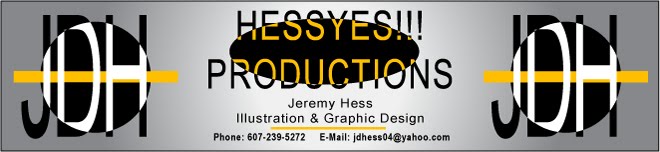
The final design has a feeling of depth brought on by the way I've broken up the shape and text of the logo to the point where it feels as if there's a layered effect to it. I chose black and white because when I drew the thumbnail, I liked the appearance but I added the yellow in order to add that dash of color that broke up the logo and gave it a more dynamic look. I chose yellow because it's not a color I would naturally go with and it seemed to be the most interesting color to compliment the rest of my design.
I'm pleased overall with how my design turned out and I'm comfortable with each element that I put into it.

New Site
10 years ago
No comments:
Post a Comment